Welcome to the new year of 2021, where home decor trends are set to take center stage with vibrant and captivating colors. As we dive into the world of interior design, it’s essential to embrace the latest color schemes that will redefine our living spaces. From calming retreats to bold statements, this article will guide you through the top color choices that are in for home decor in 2021.
Color has a profound impact on our emotions and mood, making it an influential factor in interior design. The second section of this article explores the psychology behind colors and how they can influence our overall well-being within our homes. By understanding this connection, we can choose colors that create spaces that bring us joy, tranquility, and energy.
Nature-inspired decor continues to rise in popularity, bringing earthy tones and organic hues into our living spaces. The third section delves into biophilic design and its influence on home decor choices. Whether it’s incorporating natural materials or embracing botanical colors, incorporating nature into our interiors allows us to feel more connected to the environment while creating a soothing ambiance in our homes.
In summary, with each passing year comes new possibilities for revamping your living space with exciting color choices. From exploring the psychology behind colors to embracing nature-inspired hues and incorporating bold accents, 2021 is all about setting the stage for colorful interior designs that reflect your unique personality. So let’s dive into this exciting world of home decor trends and discover what colors are in for 2021.
Exploring the Psychology Behind Colors
When it comes to home decor, color plays a crucial role in creating the desired atmosphere and evoking specific emotions. Understanding the psychology behind colors can help homeowners make informed choices when it comes to selecting hues for their interior spaces. From calming retreats to vibrant statements, each color has its unique impact on mood and emotions.
The Power of Warm Colors
Warm colors such as reds, oranges, and yellows are known for their ability to energize and create a sense of warmth in a space. These hues are often associated with feelings of happiness, excitement, and passion. They can be used in areas where homeowners want to stimulate conversation and create an inviting ambiance, such as living rooms or dining areas.
The Soothing Effects of Cool Colors
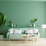
Cool colors like blues, greens, and purples have a calming effect on the mind and body. These hues are often associated with tranquility, relaxation, and serenity. They work well in bedrooms, bathrooms, or any area where homeowners want to create a peaceful retreat-like atmosphere. Cool colors can also make smaller spaces appear larger when used strategically.
The Versatility of Neutral Colors
Neutral colors like whites, grays, beiges, and taupes are often chosen as base colors for interior design. These hues provide a blank canvas that allows other elements in the room to stand out. Neutrals are known for their timeless appeal and versatility. They can be paired with any other color to create different moods or styles depending on the homeowner’s preference.
Using Accent Colors for Impact
Accent colors play an essential role in adding visual interest and impact to interior spaces. By incorporating bold hues like emerald green or mustard yellow as accent colors through accessories or statement pieces of furniture, homeowners can achieve a dynamic look without overwhelming the entire space.
Embracing Nature
In recent years, there has been a growing trend towards bringing elements of nature into interior design. This year, the trend continues with the rise of biophilic design. Biophilic design is all about creating spaces that foster a connection with nature, and one way to achieve this is through the use of earthy tones and organic hues in home decor.
One of the main benefits of incorporating earthy tones and organic hues into your home decor is the sense of calmness and tranquility it can bring to a space. Colors inspired by nature, such as warm browns, soft greens, and sandy beiges, create a soothing atmosphere that helps to promote relaxation and well-being. These colors mimic natural elements like wood, foliage, and soil, creating a sense of harmony between the indoor and outdoor environments.
When using earthy tones and organic hues in your home decor, it’s important to consider the balance between warm and cool tones. For example, pairing warm terracotta with cool sage green can create a pleasing contrast that adds visual interest to a space. Additionally, incorporating natural textures like rattan furniture or jute rugs can further enhance the biophilic aesthetic.
To implement this trend in your own home decor, consider starting small with accessories like throw pillows or artwork featuring earthy colors. If you’re feeling bold, you can also experiment with painting an accent wall or incorporating larger pieces of furniture in these natural hues.
- Incorporate earthy tones through paint colors: Choose shades like warm browns, muted greens, or soft beiges for your walls to create a cozy atmosphere.
- Bring nature indoors with plants: Add potted plants or hanging planters to your space to infuse it with organic elements.
- Use natural materials: Opt for furniture made from materials like wood or rattan to further enhance the biophilic design.
- Accessorize with earthy-colored accents: Add throw pillows, blankets, or artwork in earthy tones to infuse your space with nature-inspired hues.
By embracing nature through the use of earthy tones and organic hues, you can create a home that not only looks beautiful but also promotes a sense of serenity and connection with the natural world. With biophilic design on the rise, it’s time to bring the outdoors in and embrace the calming power of nature in your home decor choices for 2021.
Serenity and Tranquility
Creating a Peaceful Atmosphere
In a world that can often feel hectic and stressful, incorporating soft neutrals and pastel shades into your home decor can create a calming retreat where you can unwind and recharge. These colors help to create a serene atmosphere that promotes relaxation, making them the perfect choice for bedrooms, living rooms, and other areas where you seek tranquility.
The Power of Neutrals
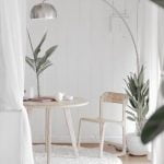
Soft neutrals such as beige, ivory, and gray are timeless choices that exude sophistication and elegance. These colors provide a neutral backdrop for other elements in your design while also promoting a sense of calm. Soft neutrals can be used on walls, furniture pieces, and even larger accessories like curtains or rugs.
Embracing Pastels
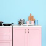
Pastel shades like light blue, pale pink, and mint green are another excellent option for creating a tranquil space. With their gentle hues, pastels add a touch of femininity and softness to any room. Consider incorporating pastel accents through pillows, throws, artwork, or smaller decorative items to create visual interest without overwhelming the space.
Pairing Soft Neutrals with Pastels
To achieve the ultimate calming retreat at home, consider combining soft neutrals with pastel shades. The combination of these gentle colors creates a harmonious palette that invites peace and tranquility into your space. For example, pair a soft beige wall color with blush pink accents or combine light gray furniture with pale blue accessories. Experiment with different combinations to find the one that speaks to you and creates the desired atmosphere.
By utilizing soft neutrals and pastel shades in your home decor for 2021, you can transform your living spaces into peaceful sanctuaries where you can relax and unwind from the demands of daily life. Whether it’s through neutral walls or pops of pastel in your accessories, these soothing colors will create a serene atmosphere that promotes tranquility and well-being.
Embrace the calming power of these colors and let them guide you towards creating a peaceful retreat within your own home.
Bold and Vibrant Statements
In interior design, color plays a crucial role in setting the mood and overall atmosphere of a space. If you’re looking to make a statement and infuse your home decor with personality and pizzazz, incorporating bold and vibrant colors is the way to go in 2021.
One of the key trends this year is the use of jewel tones such as emerald green, sapphire blue, and deep amethyst. These rich hues add an element of luxury and sophistication to any room. For example, a deep emerald accent wall can create a striking focal point in a living room or bedroom. To balance out these intense colors, pair them with neutral shades like cream or beige for a harmonious look.
Another popular choice for adding vibrancy to interior design is through playful pops of bright colors. Think vibrant yellows, oranges, pinks, or even neon hues. These bold accents can be incorporated through accessories like decorative pillows, rugs, or artwork. An unexpected burst of color can transform a dull space into something lively and energetic.
If you prefer a more subtle approach but still want to incorporate bold colors into your home decor, consider using them as accent furniture pieces. A brightly colored sofa or chair can become the showstopper of a room that is otherwise decorated in neutral tones. This technique allows you to express your personal style while maintaining balance and harmony within the space.
Mixing and Matching
One of the key aspects of interior design is understanding how to mix and match colors to create harmonious palettes. Choosing the right color combinations can greatly impact the overall aesthetic and atmosphere of a space. In 2021, this art of color combos takes center stage in home decor trends.
When it comes to mixing and matching colors, one important principle to keep in mind is the concept of the color wheel. The color wheel provides a visual representation of how different hues relate to each other. It consists of primary colors (red, yellow, and blue), secondary colors (orange, green, and purple), and tertiary colors (created by mixing secondary colors with adjacent primary colors). Understanding these relationships on the color wheel can help guide your choices when creating harmonious palettes.
Another strategy for successful color mixing is exploring different shades, tints, and tones within a specific color family. This allows for subtle variations that add depth and interest to a space. For example, pairing different shades of blue can create a soothing and serene environment, while combining warm earthy tones like terracotta and mustard yellow adds warmth and richness to a room.
In addition to understanding color theory, it’s important to consider the mood you want to evoke in each space when choosing color combinations. For instance, combining cool blues and greens can create a calming atmosphere perfect for bedrooms or bathrooms. On the other hand, vibrant pops of bold colors like orange or fuchsia can infuse energy and personality into living areas or home offices.
Creating harmonious palettes in home decor involves experimenting with different combinations until you find what works best for your personal style and the desired ambiance of each room. Whether you prefer monochromatic schemes for a minimalist look or contrasting complementary colors for a bolder statement, there are endless possibilities when it comes to mixing and matching colors in 2021 home decor trends.
Timeless Elegance
Classic color schemes have stood the test of time and continue to be a popular choice for interior design. These timeless combinations exude elegance and sophistication, creating a refined atmosphere in any space. Whether you prefer traditional or contemporary styles, incorporating classic color schemes into your home decor can elevate the overall aesthetic and make a lasting impression.
One classic color scheme that never fails to impress is black and white. The contrasting tones create a sense of balance and harmony while adding a touch of drama to the space. Black and white can be used in various ways, such as pairing black furniture with white walls or vice versa. This combination is especially effective in modern or minimalist designs, where clean lines and simplicity are key.
Another classic color scheme that exudes elegance is the combination of navy blue and gold. Navy blue brings depth and richness to a space, while gold accents add a touch of luxury. This combination works well in both formal and casual settings, adding a sense of opulence without being overwhelming. Consider using navy blue as the dominant color in larger elements like walls or furniture, while incorporating gold accents through accessories like lighting fixtures or decorative objects.
Lastly, the pairing of soft greys with whites creates a timeless color scheme that radiates sophistication and serenity. The subtle contrast between these two hues adds depth to the space without overwhelming it. This combination is particularly suitable for creating cozy retreats, such as bedrooms or living rooms where relaxation is key.
Incorporating classic color schemes into your home decor not only adds a touch of elegance but also ensures that your design choices will remain relevant for years to come. To further enhance the timeless appeal, consider using high-quality materials and investing in pieces with timeless designs. By combining classic colors with quality craftsmanship, you can create spaces that are both visually stunning and enduringly stylish.
Making a Splash with Accents
When it comes to home decor, accent colors play a crucial role in adding depth, interest, and personality to any space. In 2021, there are certain colors that are making a splash and becoming the hottest choices for accents. These accent colors can instantly infuse life into your home decor and elevate the overall aesthetic of your interior design.
One of the standout accent colors for 2021 is mustard yellow. This vibrant and warm shade adds a pop of energy and optimism to any room. It works particularly well when used in accessories such as throw pillows, curtains, or artwork. Mustard yellow pairs beautifully with neutrals like white, gray, or beige, creating a modern and fresh look.
Another popular accent color for 2021 is emerald green. This rich and luxurious hue brings a sense of elegance and sophistication to any space. Whether used in a velvet armchair or incorporated into decorative elements like vases or lamps, emerald green adds an element of drama and intrigue. It complements other jewel tones like sapphire blue or amethyst purple for a stunning color palette.
In addition to these bold choices, pastel pink is also taking center stage as an accent color for 2021. Soft and romantic, pastel pink creates a calming and serene atmosphere in any room. Consider using it in small doses through accents such as blankets, candles, or wall art to add a touch of femininity and charm to your home decor.
From Walls to Furniture
The color choices for different elements of interior design in 2021 can greatly impact the overall aesthetic and atmosphere of a space. From walls to furniture, choosing the right colors is essential in creating a cohesive and visually pleasing home decor. In this section, we will explore some of the best color choices for different elements of interior design in 2021.
When it comes to walls, neutral tones continue to be popular in 2021. Shades of white, beige, and gray create a versatile canvas that can easily complement various styles and accent colors. These soft neutrals provide a calming backdrop for any room and allow other design elements to stand out. Alternatively, bold accent walls are also trending in 2021. Opting for dark colors like navy blue or deep forest green can add depth and drama to a space.
When selecting furniture colors, earthy tones are on the rise in 2021. Natural wood finishes with warm undertones bring a sense of warmth and coziness to a room. Furniture pieces in shades of olive green, terracotta, or deep chocolate brown can also add an earthy touch while making a statement in the space. On the other hand, incorporating pops of vibrant colors through furniture pieces is another trend for those looking to add personality and playfulness to their interior design.
In addition to walls and furniture, pay attention to color choices for other elements such as curtains, rugs, and accessories. Curtains in soft pastels like blush pink or sky blue can create an airy and ethereal look. Meanwhile, rugs with bold patterns or vibrant hues can make a strong design statement while tying together different elements in a room. Incorporating colorful accessories such as pillows or artwork is another way to infuse vibrancy into your decor scheme.
Conclusion
In conclusion, 2021 promises to be an exciting year for home decor enthusiasts as they embrace their personal style and expression through colorful choices. The trends this year offer a wide range of options for creating unique and inviting spaces that reflect individual tastes and preferences.
One of the key takeaways from this exploration of home decor colors for 2021 is the importance of understanding the psychology behind colors. By selecting hues that elicit certain emotions and moods, homeowners can create environments that promote serenity, tranquility, or bold energy, depending on their desired atmosphere.
Another significant trend in 2021 is the incorporation of nature-inspired elements into interior design. Earthy tones and organic hues are gaining popularity as part of the biophilic design movement. This approach brings the outdoors inside, fostering a connection with nature that promotes well-being and a sense of calm.
Moreover, mixing and matching colors has emerged as an art form in itself. Understanding color combinations and creating harmonious palettes allows homeowners to experiment with different shades and create unique visual interest within their spaces. From classic color schemes that never go out of style to accent colors that add a pop of vibrancy, there are endless opportunities to make a statement through color.
Ultimately, all these trends coalesce into one overarching theme: embracing personal style and expression through colorful home decor choices. Whether it’s soft neutrals or vibrant statements, homeowners are encouraged to let their imagination run wild and infuse their living spaces with elements that showcase their true selves. So go ahead and explore these exciting trends in home decor colors for 2021 – it’s time to transform your space into a reflection of your personality.
Frequently Asked Questions
What is the new color for decorating in 2021?
The new color for decorating in 2021 is Ultimate Gray and Illuminating Yellow. These two colors were chosen as the Pantone Color of the Year and symbolize strength, resilience, and hopefulness – all qualities that are especially relevant in the current global situation.
Ultimate Gray is a practical and dependable neutral tone that evokes stability and endurance, while Illuminating Yellow brings vibrant energy and optimism to any space. Together, these colors create a harmonious balance of warmth and solidity, making them an excellent choice for adding a touch of contemporary flair to your home decor this year.
What is the best color for the interior of a house in 2021?
When it comes to choosing the best color for the interior of a house in 2021, there isn’t a single definitive answer as it largely depends on personal taste, preferences, and the specific ambience one wants to create within their home. However, there are some notable trends that have gained popularity this year. Warm neutrals like beige, taupe, or off-white continue to be favored choices as they create a calming and welcoming atmosphere.
Additionally, earthy tones such as warm browns or muted greens have also emerged as popular options for those seeking a connection with nature indoors. Ultimately, selecting the best color for your interior involves considering factors like lighting conditions, room size, existing furniture and decor elements so that you can achieve a cohesive and aesthetically pleasing look.
What is the most popular wall color for 2021?
The most popular wall color for 2021 is likely to be Classic Blue. As Pantone’s Color of the Year in 2020, this deep shade of blue captivated many designers and homeowners alike with its timeless elegance and sense of tranquility it brings to any space. Classic Blue has proven versatility, working well as both an accent wall or as an overall hue throughout a room.
Its sophisticated yet calming presence makes it suitable for various interior styles – from modern minimalist to traditional settings. Moreover, greige (a mix between gray and beige) has also gained popularity in recent years and is considered a safe and versatile choice for those wanting a neutral and contemporary look. Ultimately, the most popular wall color depends on personal preferences as well as the overall design concept and atmosphere one wishes to create within their home.

I’m thrilled to be your companion on this exciting journey through the world of home decor and design. With a passion for turning houses into homes and a keen eye for the finer details, I’m here to help you transform your living spaces into beautiful, functional, and meaningful havens.


